How to Style Light Pink with Neutral Shades for a Balanced Look
Light pink has a gentle charm that seems to invite you into the room with it. It adds a certain warmth but doesn't overpower, and it has a soft elegance that works with just about every interior style. The real magic happens, though, when you investigate light pink color combinations with neutrals because that's when the shade really becomes settled, balanced, and polished. Be it living room styling, refreshing your bedroom, planning a home office makeover, or simply searching for fresh ways to decorate for gatherings and celebrations, understanding how to make the most of this color makes quite a difference in the final look and feel of any space.
Why Light Pink Works Beautifully with Neutral Shades
Light pink is naturally soothing, so it goes with dependable neutrals such as beige, ivory, taupe, grey, and white. These colours even out pink's sweetness and render it polished, not playful. Neutrals also anchor the space, preventing the room from ever feeling too feminine or sugary.
Designers love using this palette because it works in every setting, from a minimalist apartment to a traditional Indian home; it also transitions beautifully from everyday styling to special occasions, which is why the combination of light pink color and neutrals works even when it comes to festive hosting or themed decor. When combined with the right textures and finishes, the result feels graceful, warm, and lived in rather than staged.
How to Choose the Right Neutral Partner
The neutral shade you will pick changes the mood of the whole look, so it would depend on what atmosphere you want to evoke with the colors that go with light pink.
Beige and Cream
This combination conveys a soft, blended appearance that feels cozy and comforting. It is ideal for relaxed areas, such as reading corners and bedrooms.
Gray
A light pink combination paired with gray brings in an instant modern touch, making it a favorite option for contemporary homes and workspaces.
Taupe and Soft Brown
These muted shades add depth without breaking the soft palette, creating subtle contrast while still keeping everything calm and cohesive.
Try putting fabric samples, wall cards, or even everyday objects next to each other before committing to a color combination with light pink. The right pairing will immediately feel natural and harmonious.
Light Pink in Living Rooms
A living room styled with a light pink combination color brings instant softness without losing character. Even one element, like a pale pink sofa, blush-colored ottoman, or pastel accent chairs, will change the tone of the space when set against neutral walls and natural flooring.
Texture is what keeps this colour palette interesting. Use layered throws, woven rugs, scatter cushions, and soft knits to add dimension. When you want a more refined or festive feel, bring in metallic details through decor trays, candle stands, or soft gold frames. A few well-placed touches are enough to give the setting a relaxed yet intentional look.
Balance light pink with deeper gray seating, dark wood tables, or matte black decor for a slightly more urban feel. The contrast keeps the palette from feeling too delicate, adding structure to the space.
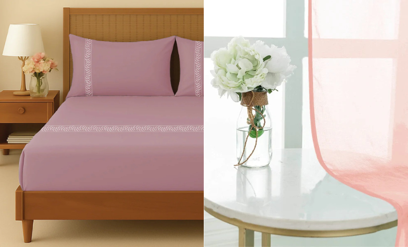
Light Pink in Bedrooms
Light pink color combinations work best to bring a calming effect within the bedrooms. A feature wall painted in this color, a pastel bedding set, or even a single piece of furniture will create a peaceful base when matched with soft whites, warm beige, or quiet grays.
Layered textiles make all the difference here. Think of knitted throws, silky cushions, natural wood side tables, or ceramic lamps. Even though the room uses a minimal color palette, it feels inviting and lived in due to the textures.
Seasonal decorating also becomes simpler. Instead of having to change the whole setup for festive events or moments, you simply need to refresh the accents. A new set of cushions, fresh flowers, warm lighting, or a backdrop of flowing white curtains can shift the mood in an instant without disrupting the main palette.
Light Pink in Home Offices
Light pink is not restricted to the bedroom or living areas. It works great in workspaces, too, especially when one wants the place to feel productive without looking dull. A light pink combination with clean neutrals does indeed create a work zone that feels focused yet soft on the eyes.
Pair a pastel accent wall with light wood desks, soft beige flooring, and organized storage to keep the space fresh and clutter-free. Add subtle decor like framed prints, indoor plants, textured rugs, or stationery in complementing shades for inspiration and creativity.
Even the smallest desk placed beside white curtains can be much brighter and more thoughtfully styled, especially when the light filters through fabric.
Expert Tips for Using Light Pink the Right Way
The secret to the perfect combination of light pink color is balance. The color should not take over the space but work in conversation with the neutrals around it.
Let Neutrals Lead
Go for neutrals as base layers on things like walls, flooring, and major furniture pieces, and let light pink pop up in those softer accents so the look feels effortless, not theme-based.
White Always Works
White is one of the most reliable answers to what colors go with light pink. Adding elements like white flowing curtains, soft white bedding, or white-framed decorated items keeps the space airy and bright.
Add Texture for Depth
-
Soft velvets, knitted throws, wool carpets, and tactile cushions make the palette feel warm rather than flat.
-
Use Metal and Natural Materials Textures of brass, stone, wood, and ceramic add depth, especially when the palette stays pastel.
-
Add Small Colour Pops If Needed Soft sage green, muted coral, or warm gold accents create gentle contrast while still being harmonious.
Also Read - Perfect Color Combinations That Match with Blue
Final Thoughts
Light pink color combinations evoke elegance, warmth, and calmness that work across various rooms and styles. Once you understand what colors go with light pink and how to balance the shade with neutrals, it becomes pretty easy to style the living room, bedroom, and even your workspace without feeling restricted.
Whether you lean toward modern decor, classic styling, or cosy everyday living, this palette adapts effortlessly. You will be able to make the space feel both elevated and deeply personal with thoughtful layering, the right mix of textures, and accents such as flowing white curtains or warm metallic pieces.